The Covid-19 infodemic: how we fought back with data
When Covid-19 first hit the world, African governments faced a health data scarcity crisis. Without information like the number of available hospital beds or ventilators, it was difficult for authorities to make critical decisions on how best to manage resources.
In response, Code for Africa set out to create important tools and resources that would provide real-time information to authorities and citizens alike. The first project was OUTBREAK.AFRICA, which was meant to help decision makers distribute vaccines efficiently.
The second tool, PesaYetu, leveraged technology with the aim of enabling journalists to not only report on the situation more accurately, but also hold their governments accountable.
OUTBREAK.AFRICA
When Covid-19 vaccines started rolling out, Code for Africa embarked on building OUTBREAK.AFRICA, a data and community project to combat the Covid-19 infodemic and to help decision makers identify how to geographically distribute vaccines depending on their vaccination prioritisation rollout plan. The project was listed in the top 10 Covid-19 data journalism projects in 2020 by DataJournalism.com.
At the time, the world was also facing a serious problem. As the disease spread, so did the misinformation surrounding it. People were given misleading and confusing accounts on how to protect themselves while vaccines sat unutilised in hospitals.
To deal with the problem, we adopted a multipronged approach which included four components: data research and visualisation, story production, debunking, Wikipedian-in-Residence and a rolodex of experts.
Data research and visualisation
The data research and visualisation component helped to track the spread of the virus and identify hotspots. When we started, vaccination uptake was still low in Africa, which means there were many vulnerable people who needed to be prioritised. Our first task was to develop the African Covid-19 Vulnerability Index, which was determined by combining a number of metrics and datasets. It was also meant to help identify the areas that were most at risk based on those parameters.
The National Deployment and Vaccination Plan was our starting point, and it helped us identify the vaccination rollout phases. This in turn allowed for the sourcing of datasets in each phase. For example, when Kenya wanted all teachers vaccinated, we sourced the number of teachers in the country as well as at the subnational level. With this, decision-makers could determine how to geographically distribute vaccine doses for particular target groups.
How the platform was designed
OUTBREAK.AFRICA was designed as a one-stop-shop for Covid-19 analysis and reports from healthcare workers and a big part of the website is a dashboard of Covid-19 data for five African countries. Apart from showing the vulnerability index, the platform also contains datasets, research, and debunks on social media sites like Facebook. In future, it will also serve as a data collection tool for real-time field reporting from healthcare workers
Datasets range from information on vaccination status to more general statistics like population demographics, and availability of healthcare workers. This is particularly helpful to identify potential gaps in the country’s capacity for effective medical response. One major consideration while designing the website was maximising user experience. Users could either scroll through to get the bulk of the data, or select a pre-configured view. The modular nature of the charts also allows flexibility, when — as we add more countries — we may incur into data availability issues.
Other components of the project
The story production component helped to create engaging content that highlights the work of frontline workers and raises awareness of reliable sources of information. The debunking component helped to identify and correct false information about the virus.
The Wikipedian-in-residence component provides training on how to write accurate Wikipedia pages related to the pandemic. And finally, the rolodex of experts provided reliable sources of information on a variety of topics related to the pandemic.
Finding data is still a major challenge
Access to data was the major challenge in the project. Finding data on a sub-national or regional level was difficult and we opted to use national-level datasets found in open data portals such as the World Bank. For some counties, the data was only available as pdf reports, and the scraping and cleaning process was tedious. In Kenya, for example, there are 47 counties and each county has its own pdf report. Our attempts to reach out to various government agencies to partner with us on OUTBREAK yielded little success.
2. PesaYetu
Corruption and misuse of funds are common in county-level governments in Kenya but the public isn’t equipped with the knowledge to hold their local governments accountable. A majority of the public relies on radio stations as their main source of news and information. PesaYetu is part of the Our County, Our Responsibility project that aims to upskill 56 citizen reporters in 14 grassroots radio stations across 8 different counties in Kenya to hold their governments to account by reporting on budget and development issues in their respective counties. The project is funded by BMZ, in partnership with KCOMNET and CAMECO and aims to train the reporters, support story production and create the PesaYetu platform.
Platform design
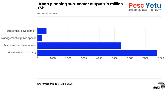
The PesaYetu platform is designed to allow users to explore dozens of datasets and data visualisations on budget spending and constituency features via interactive data visualisations. The dashboard allows users to get granular data relating to counties, including budgets, demography and infrastructure.
One of the most interesting features of the platform is the possibility for users to pin and compare two counties or municipalities. Pinning features would turn the single-column layout of the dashboard into a two-column split where two locations are compared side-by-side.
Story Production
Our team of data analysts supported the participants with creating social media assets in the form of simple infographics and visualisations using Flourish and Canva. These assets, which include audio recordings, are published on the respective Facebook, Twitter, Instagram and WhatsApp accounts.
Tool Development
The County Integrated Development Plan (CIDP), a five year plan developed by each county, formed the basis of our data analysis. We sourced the CIDP for each of the 8 counties, which were only available in pdfs. We then scraped hundreds of data tables from each pdf into a spreadsheet, clean and upload them to the database to create the interactive charts.
Getting clean data a persistent challenge
Just like the OUTBREAK.AFRICA project, the inability to collect clean data was the main challenge we experienced while developing PesaYetu. Scraping hundreds of pdf documents was tedious and significantly increased our workload. And the fact that different counties reported data differently made it difficult to compare trends and get meaningful insights. For example, one county would publish data on the number of children enrolled in private schools and another would show the number of children in high schools. A county with high tourism would publish data on tourism and a county focused on agriculture would have more data on agriculture.
Another frustrating challenge were budget figures not adding up, and there was lack of metadata on abbreviations. Granular project and budget data were also not straightforward to clean and visualise.
OUTBREAK AFRICA and PesaYetu are just some of the projects we work on at CfA. The themes and topic of each project may be different but our ethos behind data being used for change and impact in Africa remains the same. All our projects are open-source and available on Github.
If you’d like to learn more about data visualisation, academy.AFRICA is Code for Africa’s initiative offering free training in the form of webinars, in-person training and MOOC courses. The MOOC has a few introductory courses on data visualisation covering topics such as the different types of charts and how to use tools such as Flourish.
_____
Code for Africa (CfA) is the continent’s largest network of civic technology and data journalism labs, with teams in 21 countries. CfA builds digital democracy solutions that give citizens unfettered access to actionable information that empowers them to make informed decisions, and that strengthens civic engagement for improved public governance and accountability. This includes building infrastructure like the continent’s largest open data portals at openAFRICA and sourceAFRICA. CfA incubates initiatives as diverse as the africanDRONE network, the PesaCheck fact-checking initiative, the sensors.AFRICA air quality sensor network and the research and analysis programme CivicSignal.
CfA also manages the African Network of Centres for Investigative Reporting (ANCIR), which gives the continent’s best muckraking newsrooms the latest possible forensic data tools, digital security and whistleblower encryption to help improve their ability to tackle crooked politicians, organised crime and predatory big business. CfA also runs one of Africa’s largest skills development initiatives for digital journalists, and seed funds cross-border collaboration.


